With the help of my creative team I am starting a serie of blogposts with tips, tricks and ideas. My current plan is to offer you a little help with design, journaling, shortcuts you can use to improve your layout making process and enjoy your memory keeping even more than I bet you already do.
Our first post is about design and it covers repetition. It is a technique I really love and I use over and over again. it can make your layouts look better and much more interesting and it can also solve design problems. The best thing about it is that options are endless. You can repeat photos, elements, shapes, create blockings or increase the depth by layering stuff.
Let's take a look at some examples my creative team and I prepared to illustrate.
SHAPE REPETITION: Repeating shapes give the whole design a uniform look and sometimes makes it more interesting. You can repeat shapes on the background - something that we can see a lot, specially in page templates - or you can repeat shapes as an element such as rings, circles, hearts, stars, they usually go with the theme to give more meaning to the idea you want to convey.
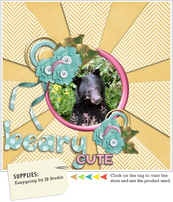
IN ACTION: Experts say you shouldn't center a photo when creating a layout, however you can see Brandi gave it a totally different look by repeating the shape on the background, making the center of her layout the focal point without being boring. She also repeated elements in different sizes. You can see she gave her layout a more interesting look and also solved a design problem when centering her photo.
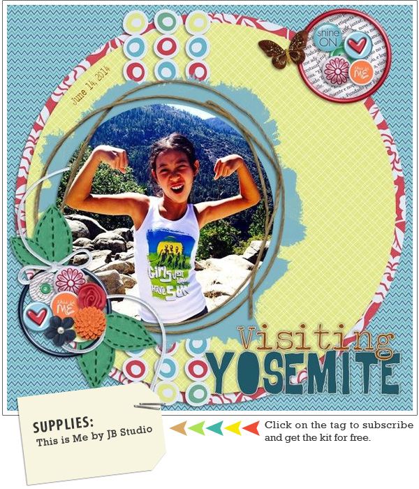
IN ACTION: You can also overlay shapes creating more depth. Emily chose circles and repeated them in different sizes and materials as you can see she added a string, rings, patterned paper circles as mats, cropped her photo in a circle shape and repeated a border with circles three times.
ELEMENTS REPETITION: Nowadays it is very common to see repetition of elements in layouts because clustered layouts are so hot! It is beautiful and give us so many things to look at. Repeting elements can also solve design problems as it helps you to add balance to a layout.
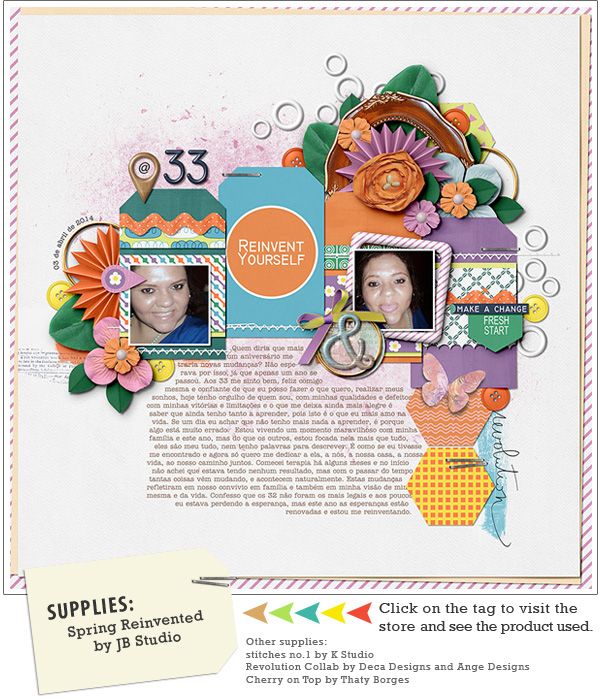
IN ACTION: As a paper scrapper I don't feel very comfortable clustering too much but I love layering, so layering elements is something I do a lot. In this layout you can notice I repeated the tags under the photos layering them. You can also see repetition of flowers, leaves, rings, staples and shapes. I told you I love this technique.
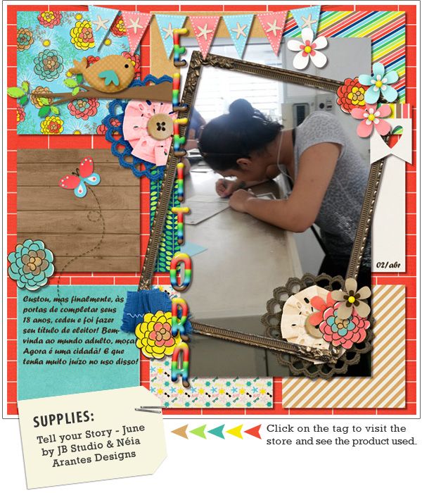
IN ACTION: Andrea created a blocking on her background using square pieces of different patterned paper and added elements on some corners. Rotating the frame a little added an interesting look otherwise it would be too straight.
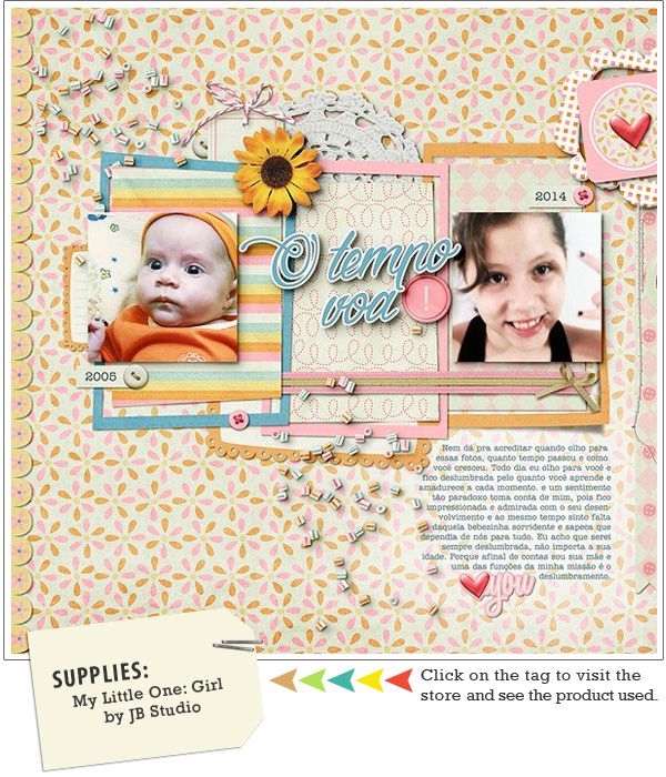
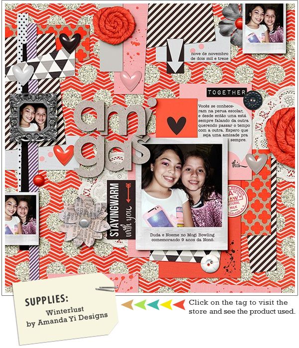
IN ACTION: My layout has a totally different approach using the same technique because I didn't worry about adding pieces of paper in a straight line or in a definite space. I love making layouts like this because I just go with the flow. I go cropping patterned paper and layering them until I get a look that I like. Of course this gives me extra shadowing work - everything has pros and cons.
PHOTO REPETITION: Some scrappers like to scrap a unique photo, but if you are like me and you like adding lots of pictures, repeating can help you out. Sometimes you don't have many photos to showcase the story you want to tell so you can repeat them. Sometimes repeating and cropping them in specific ways help you to tell the story.
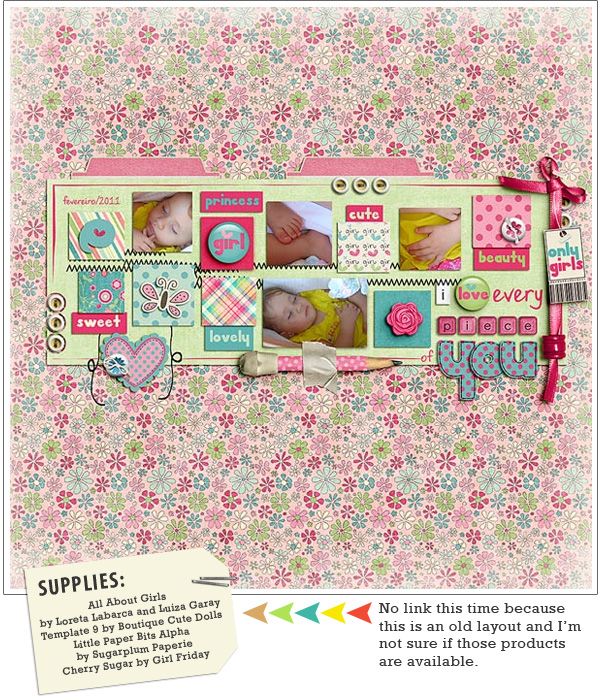
IN ACTION: I got very inspired by the quote "I love every piece of you" and as I rarely do, decided to make a layout that the quote and the pictures would say it all. However, I didn't have a photo of each piece of my daughter so I repeated the photo and cropped it in specific places to show my daughter's pieces. You can notice I used the blocking and other repetitions in this layout also. - I told you I love this technique.
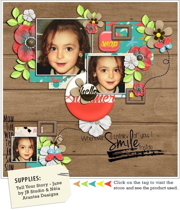
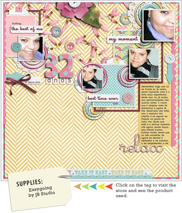
IN ACTION: Another great idea is to repeat a photo and leave only one colored or vice-versa. It may give a more emotional background to your story.
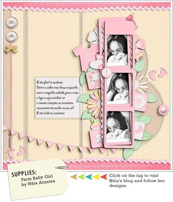
IN ACTION: In this layout I added the same ricrac and ribbon on the top and bottom edges just by duplicating and rotating them. As easy as it can be.
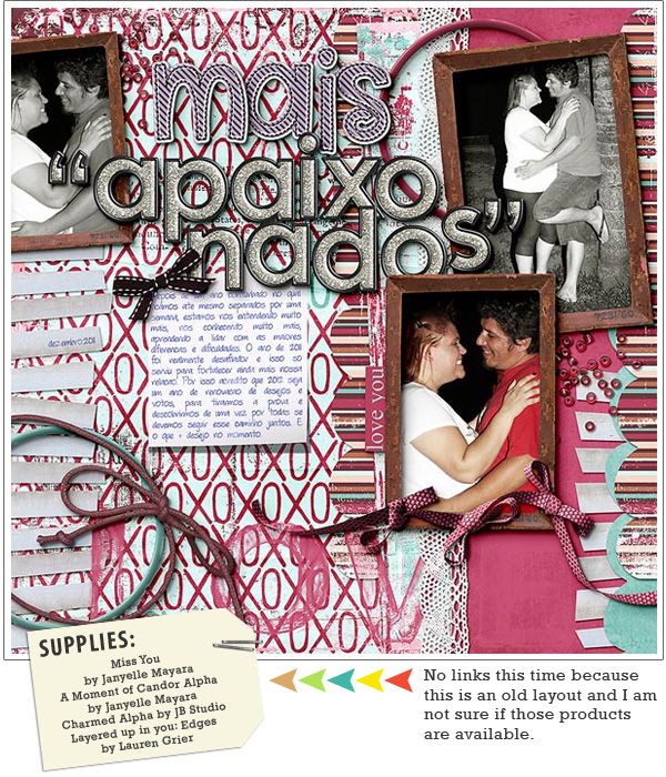
GIVE YOUR LAYOUT BALANCE: I love using repetition to give balance to a layout. I use elements such as ribbons, ricracs, decorative borders and/or patterned paper as borders of a page, I usually add on top/bottom or right/left edges.
IN ACTION: In this layout I added the same ricrac and ribbon on the top and bottom edges just by duplicating and rotating them. As easy as it can be.
IN ACTION: And we can do that not only on the edges of a page. In this layout you can see a small scalloped border repeated on the left edge, on the right side near the edge and also on the bottom edge. Repeated framed photos and mats in different sizes also give balance.
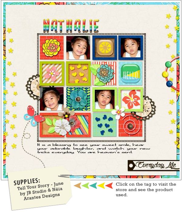
IN ACTION: As you can see in this layout made by Edna, everything creates balance. There are square blocks in straight lines centered in a bigger block, there are repeated frames over some blocks and they contrast with the others. She added the same patterned paper in the first block and the last one. She repeated the photos and flipped contrasting again and added little stars to the left and right edges.
I hope you like this first post and learn from it. If you have a layout using any of the techniques or if you use any of them to create a new page. Leave a link to your layout in the comments and I will leave you some love and also give you a special $2 coupon to JB Studio designs.
I hope you like this first post and learn from it. If you have a layout using any of the techniques or if you use any of them to create a new page. Leave a link to your layout in the comments and I will leave you some love and also give you a special $2 coupon to JB Studio designs.


No comments:
Post a Comment